The First Thing People Miss: The UI Is Telling You What the World Values
Marathon’s menus and interface are not neutral. They’re “in-universe” and full of cues that reinforce the setting: ASCII-like text blocks, glitchy panels, and icon language that feels like a terminal system.
Here’s the trick: the UI trains your brain to recognize what matters.
- The game’s icons push you to think in systems (security, access, contracts, clearance).
- The typography and warning colors teach you to treat the world like a controlled facility, not an open battlefield.
- The interface noise—glitches, overlays, distortions—suggests that information is never perfectly reliable.
If you want to understand Marathon’s design intent, don’t skip the “weird” UI moments. Those visuals are telling you: this world is built on hidden access and contested information. That becomes more and more true the deeper you go into endgame content.
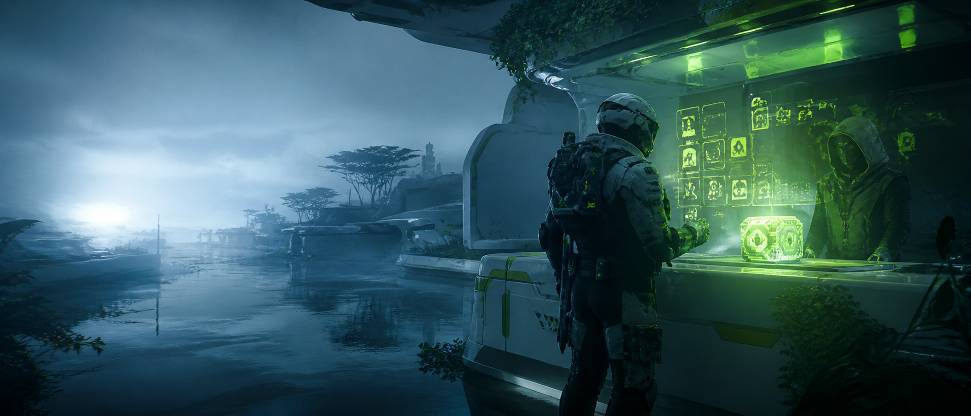
UECS Visual Language: Green Text, Boxy Displays, and “Containment Energy”
One of the most consistent environmental storytelling elements on Tau Ceti IV is how UESC spaces look and feel: dense with boxy computer displays, green scrolling readouts, and industrial panels that suggest constant monitoring. These visuals aren’t random props—they’re a warning: this is controlled territory.
When you see heavy UESC terminal presence, expect:
- tighter security (more patrol density and automated defenses)
- more “facility logic” (locked doors, clearance requirements, restricted access)
- more predictable chokepoints (because controlled architecture funnels movement)
- higher odds of contested fights (because controlled spaces often hold better value)
A useful habit:
If a building looks like a “UECS workstation maze” with constant green-readout panels, assume it is a trap-friendly environment. Move slower, clear angles first, and treat your exits like part of your loot.
Architecture as Narrative: When a Room Feels Like a Job, It Usually Is
Marathon’s spaces are not just corridors and cover objects. They often communicate a “purpose”:
- medical bays feel like medical bays
- storage wings feel like storage wings
- industrial service halls feel like service halls
That matters because purpose predicts:
- where loot spawns are likely to be
- where teams will converge
- where AI will patrol
- where line-of-sight lanes exist
If you walk into a room and it feels like:
- a loading dock (wide, open, heavy cover islands): expect long angles and third-party shots
- a server room (tight lanes, low visibility, lots of panels): expect ambushes and close-range collapses
- a clinic (rooms off a main hallway): expect “door fights” and grenade denial play
- a central hub (multiple entry points): expect constant rotations and pinches
This is visual storytelling doing tactical work. The map is quietly telling you what kind of fights it produces.
Color Is a Map: How Marathon Uses Contrast to Guide Movement
Marathon loves strong contrast: neon accents against muted industrial surfaces. That contrast is style—but it’s also navigation.
Pay attention to:
- high-saturation highlights (often guiding interactable routes, terminals, doors, or key spaces)
- repetitive color blocks (often signaling “this is the same system type as that other place”)
- warning palettes (often meaning hazard, lock, countdown, or security escalation)
A practical way to use color as a player:
- When you’re unsure where to go in a complex interior, follow “system colors” (repeated signage, repeated lighting bands).
- When you’re unsure where danger is coming from, scan for unnatural movement against high-contrast backgrounds—Marathon’s style often makes silhouettes pop if your eyes are trained to look for the right “edges.”
If you want to be the teammate who never gets lost, learn the color grammar of each zone.
Small Props, Big Meaning: Environmental Clues That Predict Human Threat
In Marathon, people leave traces. Those traces aren’t only dead bodies or loot emptiness. They include subtle scene changes that can tell you:
- another crew passed through
- how recently they passed
- what kind of fight they took
- whether they’re still nearby
Here are the most useful visual clues to train:
- Open vs closed doorsA door left open in a “normally closed” area often means someone moved quickly or fled.
- Multiple doors open in a chain often means a chase happened.
- Loot container stateMany containers have a “opened” look. If several in a row are opened, that route was farmed.
- If only high-risk containers are opened, you’re dealing with a confident crew.
- Dead UESC clustersIf you see fresh UESC bodies, assume a crew recently fought here.
- If there are too many bodies for one quick skirmish, assume the fight was loud and may have attracted a third party—meaning other teams could still be rotating in.
- Bullet marks and impact scarsImpact patterns can reveal where people held angles.
- A wall peppered at head height near a doorway suggests prefire habits—expect an aggressive defender mentality.
- Dropped items / leftover ammoPeople drop what they can’t carry. If you see discarded lower-value items, a crew likely filled up and may be leaving… or may be camping exfil.
You don’t need to be perfect. You just need to notice enough to make smarter choices:
- “We’re late. This route is hot.”
- “This area was cleared but not fully looted—someone got interrupted.”
- “We should rotate wider because someone is likely still close.”
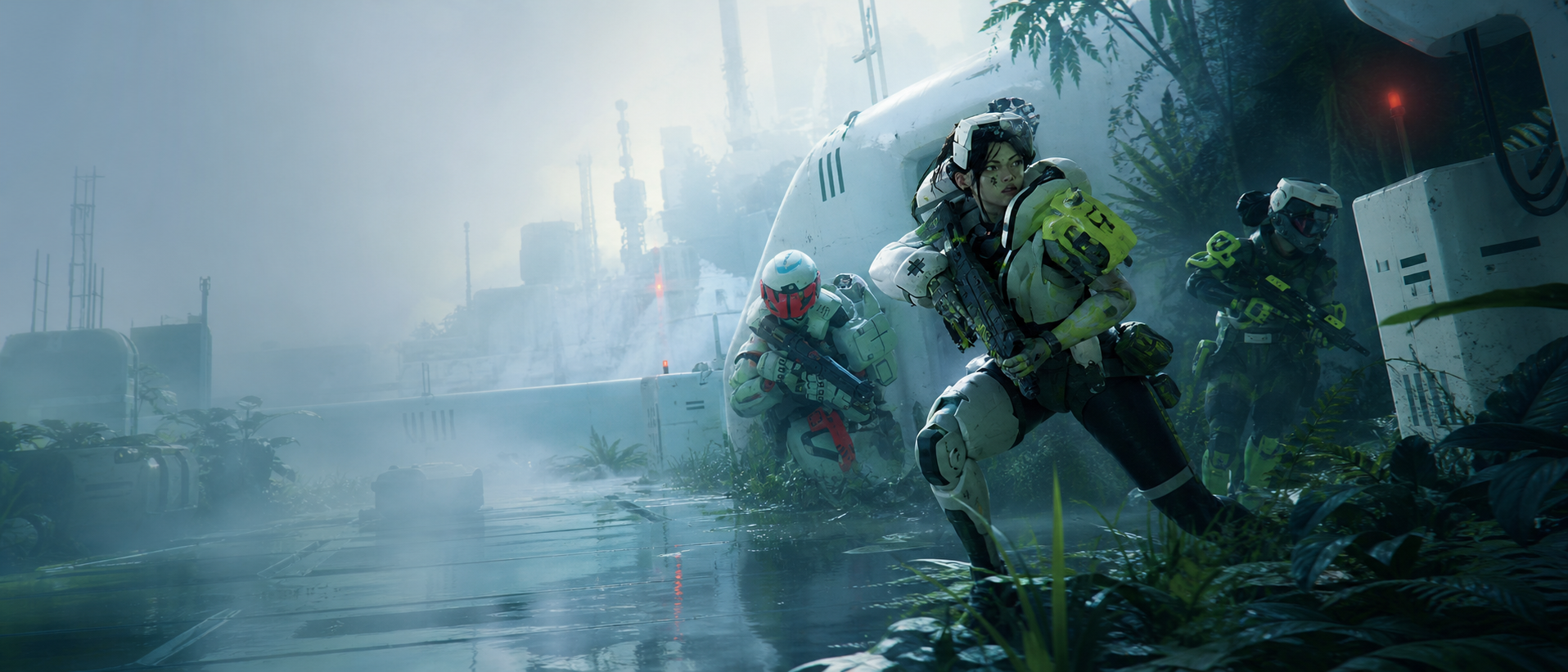
Faction Fingerprints: Six Brands, Six Behaviors
Marathon’s factions aren’t only menus and contract tracks. They’re corporate personalities that leak into visual identity: logos, signage style, UI motifs, and “how things feel.” Even if you don’t memorize each faction, noticing faction fingerprints helps you interpret a zone:
- Who might be here for a contract objective?
- What kind of loot or upgrades does this area support?
- What playstyle is being encouraged?
A simple way to think about faction fingerprints:
- Some brands feel like tech infrastructure (cleaner panels, data motifs).
- Some feel like medical supply ecosystems (clinical palettes, regenerative language).
- Some feel like weapon and attachment pipelines (industrial armory vibes).
- Some feel like bio/augmentation labs (clinical + unsettling).
- Some feel like mobility/explosives/disruption (aggressive icon language).
Even when the game doesn’t slap a giant “Faction Owned” sign in your face, the world’s visual tone often hints at which corporate culture touched a facility.
The “Retro-Future” Isn’t Nostalgia—It’s a Story About Systems
Marathon’s retro-futuristic look—ASCII vibes, old-web iconography, neon utility—doesn’t exist to be cute. It reinforces the central idea that the world is:
- built from layers of old infrastructure
- constantly monitored and logged
- controlled by security gates
- and haunted by corrupted signals
When you see:
- glitch effects
- distorted overlays
- layered UI projections in-world
That’s a reminder that the setting’s biggest threats aren’t always bullets. They’re access, surveillance, and information integrity. That theme becomes literal in endgame spaces where security clearance, vault keys, and exfil systems determine survival as much as aim does.
Cryo Archive: Visual Storytelling Turned Into a Survival Puzzle
Cryo Archive is where Marathon’s visual design becomes brutally functional. It’s an endgame zone aboard the UESC Marathon ship, structured as six interconnected wings around a central hub, with a labyrinth layout, tight corridors opening into massive spaces, intense UESC security, and frozen Vaults full of top-end loot and secrets.
If you only ever treat Cryo like “a harder map,” you miss how much the ship is communicating:
- the ship is a museum of a failed expedition
- the security systems are still alive
- the vaults are literally frozen shut
- the architecture is designed to funnel crews into conflict
Cryo teaches a visual lesson:
Everything important looks important, and everything important is dangerous.
Frozen Vaults and the Psychology of “That Looks Valuable”
Cryo’s Vaults are visually framed as special: frozen, sealed, and “not meant to be touched.” This is deliberate. The world is training you to feel temptation—and then punishing you if you chase it without preparation.
When a space is designed to look like:
- a locked exhibit
- a sealed archive
- a frozen core
It’s telling you:
- other crews will come here
- security will be heavy
- time pressure will rise
- and you need a plan to leave after you interact
If your crew’s behavior becomes “we saw the shiny thing, we ran at it,” you’ve fallen into the exact narrative trap the map is built to set.
Security Clearance Visuals: Doors That Teach You Patience
In Cryo, security clearance gates doors, supply rooms, and exfils. Visually, that means you constantly see doors with clear “you can’t do this yet” messaging. That’s not just a mechanic. It’s storytelling: you are not authorized. You are trespassing.
This changes how you should play:
- Endgame is not “go where you want.” It’s “earn access while staying alive.”
- The map’s locked doors create predictable funnels, which creates predictable PvP.
- Doors become conflict points. The moment you can open a higher-clearance door, you should assume someone is about to contest it.
When you see a locked system:
- don’t stand still staring
- treat it like a moment to reposition, clear angles, and decide if you’re willing to be loud here
The visuals are warning you: “this action will make you a target.”
Monitors and Scanners: The World’s Way of Saying “Information Is Loot”
Cryo’s systems include scanners and monitors that are not just interactables—they are visual focal points. They’re often placed in ways that make you vulnerable while using them, because the story is literally saying:
You are stealing information from a controlled system. That should feel risky.
A practical habit that turns these visuals into survival:
- When you see a terminal-like object in Cryo, assume it’s a “hands busy” moment.
- Before interacting, clear angles and assign one teammate to watch the push lane.
- After interacting, move immediately. Don’t celebrate.
Even outside Cryo, Marathon repeats this language: interactions are often placed where you can be punished, because the world is built to reward discipline.
Hazard Visuals: Lasers, Cold, and “Don’t Rush This Room”
Cryo introduces hazards that are signposted visually:
- tripwire-style laser cues
- frost/cold zones
- sealed-room traps and barriers
These hazards exist for two storytelling reasons:
- to make the ship feel actively defensive
- to punish loot-chasing behavior that ignores environment scanning
Your best “visual storytelling” upgrade is learning to slow your eyes down even when you speed your body up.
- Enter a room, flick your view to corners and door frames.
- Watch for “line” visuals that don’t match the architecture.
- Look for signage or lighting patterns that scream “security system.”
If you treat every room like a loot sprint, you will eventually run into a trap that costs your whole run.
The Central Hub Problem: Why the Middle Looks Like a Stage
Cryo’s central hub is designed like a stage: multiple entrances, big spaces, visibility lanes, and high conflict probability. The visuals communicate “this is important”—and that’s exactly why it becomes a killbox.
You should treat hub visuals as a warning:
- If the environment feels like a “grand central,” it will be contested.
- If it feels like an “arena,” it will attract third parties.
- If it looks like a “mainline route,” someone is watching it.
The pro move isn’t avoiding it forever. The pro move is:
- entering with a purpose
- staying for the shortest time necessary
- leaving before your run becomes everyone else’s opportunity
Planet-Side Environmental Storytelling: Tau Ceti IV as a Broken Supply Chain
On Tau Ceti IV, the story isn’t only “abandoned colony.” It’s “abandoned logistics.” You can feel that in the architecture and object placement:
- storage spaces that suggest rushed evacuation or sudden shutdown
- signage that implies organized industrial planning
- defensive placements that imply “this was guarded even before it collapsed”
Use this to your advantage:
- Facilities that look like supply nodes are more likely to attract players seeking value.
- Areas that look like residential or low-security spaces are often safer for quiet progress.
- Any area with heavy UESC presence is likely a “policy zone”—a place the UESC never stopped caring about.
The planet-side maps are telling a story about control, collapse, and salvage. Your job is to read which phase a location is in:
- controlled
- abandoned
- or contested
Visual Sound: When the World “Looks Loud”
Sometimes you can predict audio risk just by visuals. Marathon’s world has a consistent relationship between:
- open spaces
- reflective industrial halls
- dense interior mazes
- and where gunfights become audible or attract attention
Even without memorizing distances, you can make smarter choices by asking:
- “If I shoot here, how many routes can other teams use to arrive?”
- “Is this area a funnel where players naturally pass through?”
- “Does the architecture encourage third parties?”
In general:
- Big open corridors and hub-like spaces tend to create loud, fast third-party collapses.
- Smaller segmented interiors can contain fights… but can also become trap rooms.
Visual storytelling is the pre-audio warning system.
How to “Read” a Room in Two Seconds
You don’t have time to admire scenery mid-run. Here’s a two-second room read that turns visual storytelling into extraction consistency:
- Entry points
- How many ways can enemies enter this room? One door is safe. Three doors is chaos.
- High ground
- Is there a balcony, stair, ledge, or sightline that lets someone punish you from above?
- Hands-busy objects
- Are there terminals, loot boxes, scanners, or interactables that will make you stationary?
- Cover quality
- Is cover “real” (breaks line of sight) or “fake” (one step forward exposes you)?
- Exit plan
- If a third party arrives right now, where do you go?
If you do this quickly, your survival rate goes up immediately—because you stop treating rooms like loot chests and start treating them like tactical spaces.
Why “Art Details” Help You Win Gunfights
A lot of players assume visual storytelling is only for lore lovers. But it directly improves your PvP decision-making:
- You pre-aim the correct door because you noticed the room funnels movement.
- You don’t overcommit because you saw multiple entry points that make a hold unsafe.
- You win more third parties because you can tell a fight happened recently and you know where the reset is likely happening.
- You stop chasing into spaces that look like trap geometry.
- You extract earlier because you can “feel” when a zone is about to become hot.
The difference between average and strong players is often not aim—it’s how quickly they interpret the environment.
The “Loot Chase” Personality Trap
Marathon’s world is extremely good at making you want one more thing:
- one more container
- one more wing
- one more contract step
- one more Vault room
- one more fight for a better weapon
Visual storytelling feeds that urge by making valuable spaces look cinematic.
If you want to stop donating kits, adopt one mental habit:
When the environment looks “too important,” assume other players are already on their way.
That doesn’t mean “never go.” It means:
- go with purpose
- go with a reset plan
- go with an exit plan
- and leave before you become the story someone else tells
BoostRoom
If you want to extract more often and stop feeling like Marathon is “random,” the fastest improvement is learning how to read the world. BoostRoom helps you build that skill into your real gameplay:
- route planning that avoids predictable choke points
- learning “hot zone” visuals so you stop walking into third parties
- improving exfil setups by understanding how architecture shapes pushes
- turning environmental tells into better fight selection
- building calmer, pro-level decision-making that survives patch cycles and meta shifts
Marathon is full of clues. BoostRoom helps you notice them—and convert them into consistent wins.
FAQ
Is Marathon’s visual storytelling actually useful, or just lore flavor?
It’s useful. Doors, terminal placement, architecture, and environmental traces often predict player routes, ambush angles, and third-party timing. Learning those patterns improves extraction consistency.
What’s the easiest visual cue to start paying attention to?
Doors and entry points. If a space has multiple entrances, treat it as high risk for resets and looting. If a space funnels through one doorway, it’s easier to control.
How can I tell if another crew was here recently?
Look for opened containers, clusters of dead UESC, doors left open in chains, and impact patterns around choke points. Those visual traces often indicate recent movement or fights.
Why do UESC areas feel more dangerous?
UECS spaces are visually packed with terminals and monitored infrastructure, which usually correlates with tighter security, more funnels, and more contested value locations.