The Mindset Shift: You’re Designing Perception, Not Square Footage
“Feeling huge” comes from perception. In games and in real homes, the eye judges size by:
- How far you can see (long sightlines)
- How many layers are visible (foreground → midground → background)
- How clean the pathways are (flow and negative space)
- How consistent the surfaces feel (floor/wall/ceiling cohesion)
- How lighting guides attention (bright focal points, darker edges, gentle gradients)
A small Midnight home becomes “big” when it has depth (layers), clarity (purpose), and movement (flow). Your goal isn’t to cram more stuff inside—it’s to make the space read as intentional and navigable, with moments that surprise you as you walk.
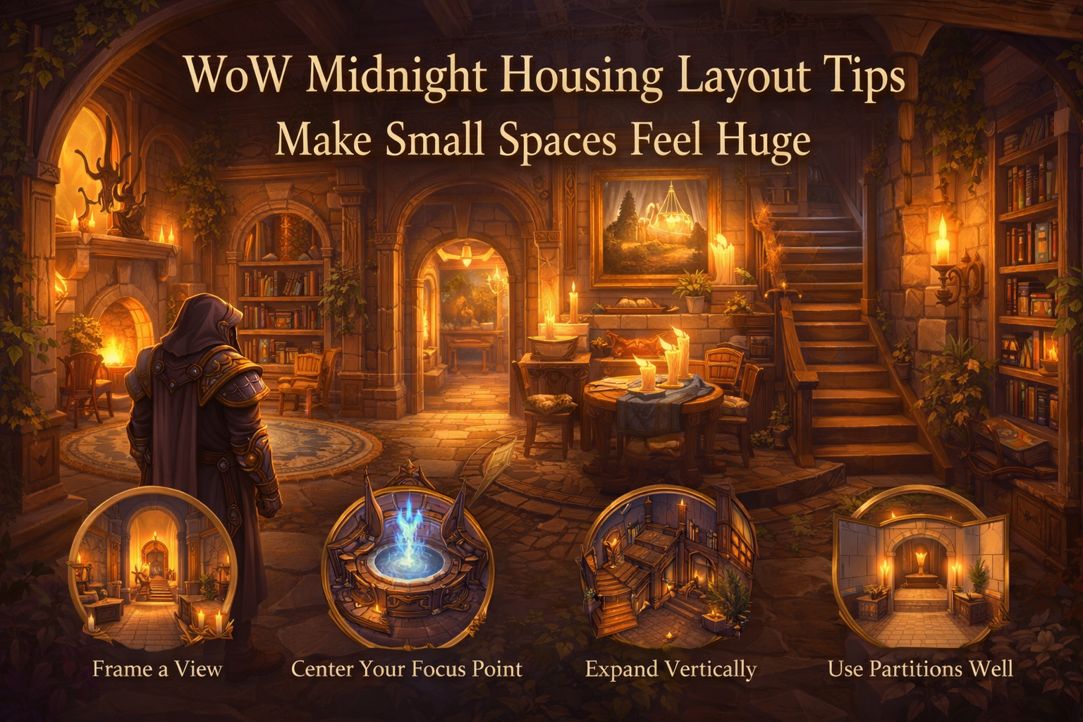
Practical Rules to Make Any Small Space Feel Huge
Use these as your non-negotiables. They’re simple, but they’re the difference between “packed” and “premium.”
- Rule 1: Build the route first, decorate second. Decide how someone walks through the home before you place furniture.
- Rule 2: Every room gets one job. Lounge, dining, library, trophy hall, workshop, garden room—one job each.
- Rule 3: Keep a clear path width everywhere. If you constantly bump into chairs, the room feels tiny.
- Rule 4: Compress → reveal. A narrow entry leading into an open room makes the open room feel twice as big.
- Rule 5: Frame a view at every doorway. Your eyes should “land” on something: a fireplace, fountain, bookshelf wall, or centerpiece.
- Rule 6: Put the tallest objects at the back. Tall shelves in the distance create depth; tall objects near the entrance feel like blockers.
- Rule 7: Use fewer, larger pieces instead of many small ones. Too many small props create visual noise and shrink the space.
- Rule 8: Repeat materials. Repetition makes areas feel connected, which makes the home feel larger.
- Rule 9: Lighting is architecture. Use light to create “rooms” even without walls.
- Rule 10: One strong focal point beats five weak ones. Choose what matters.
- Rule 11: Make corners do work. Corners are for vignettes (reading nook, trophy pedestal, herb shelf), not random clutter.
- Rule 12: Use partitions to suggest rooms, not to box everything in. Partial walls, arches, and screens increase depth without shrinking.
- Rule 13: Go vertical when you’re short on footprint. Towers, stairwells, loft illusions—height feels huge.
- Rule 14: Save “busy decor” for small zones. Busy patterns everywhere overwhelm; use them as accents.
- Rule 15: Always step back and test sightlines. If you can’t see through a doorway, you’re shrinking the house.
Start With a Floorplan That “Breathes”
Even if you only have a few rooms, a good floorplan creates the illusion of size by giving each space a clear role and a clean transition.
The easiest way to think about it:
- Public spaces near the entrance (foyer, lounge, dining, trophy hall)
- Private spaces deeper inside (bedroom, bath/spa, study)
- Utility spaces tucked away (workshop, storage, crafting corner)
That single idea alone makes a layout feel realistic—and realistic spaces read as larger because they make sense.
If you can edit your floorplan:
Use the aerial view to plan:
- Where hallways will create compression
- Where open rooms will act as reveals
- Where stairwells can create vertical drama
- Where tiny rooms can become “special purpose” spaces (closet → pantry, tiny square → shrine, hallway → gallery)
If you can only work with a small starting layout, you can still create these effects with partitions, lighting, and vignettes.
The Foyer Trick: Small Entry, Big Home
A tiny entry is not a disadvantage—it’s your strongest tool. A tight entry makes everything after it feel bigger.
Foyer recipe (works in almost any theme):
- A narrow runner rug or clean floor strip that points forward
- Two symmetrical lights (left and right) to feel “designed”
- One statement object at the far end (painting, banner, shelf, statue)
What to avoid in small foyers:
- Wide furniture that blocks the path
- Too many small props on the floor (visual clutter = smaller feeling)
- Bright lighting everywhere (you want the reveal)
Pro move: keep the foyer slightly dimmer than the next room. When you step into the main space, the brightness feels like expansion.
Sightlines: The #1 Secret to “Huge”
If you want a home to feel big, you must be able to see through it.
Three sightline types to build on purpose:
- Straight sightline: door → long room → focal point (clean and grand)
- Diagonal sightline: door → corner focal point (makes rooms feel wider)
- Layered sightline: door → foreground vignette → mid furniture → background hero piece (deep and rich)
How to create instant depth:
- Put the tallest piece at the far wall (bookcase wall, arch, big statue)
- Keep the center of the room more open than you think you should
- Use low furniture in the foreground (small table) and taller objects farther away
If your room is awkward or too square:
Diagonal sightlines are your best friend. Place your focal point in a far corner, angle a rug or furniture layout toward it, and your square room stops feeling like a box.
Hallways That Don’t Feel Like Dead Space
Hallways are not wasted space in Midnight housing—hallways are expansion tools. They create:
- Compression before a reveal
- A place for rhythm (repeating lights and frames)
- A way to separate “chapters” of your home
Hallway = gallery strategy:
- Repeating wall decor at equal spacing (paintings, banners, sconces)
- A runner rug that guides movement
- One small “pause” vignette at the end (pedestal, table, trophy)
Hallway = mood tunnel strategy:
- Dim lights, warmer tone
- Minimal wall clutter
- The next room brighter and more open
Avoid: putting storage clutter everywhere. If a hallway becomes a warehouse, the home feels smaller.
Use Partitions to Add Depth Without Shrinking Space
Partition objects let you build walls where none existed, but the goal in small homes is usually not “more walls.” The goal is more layers.
Best partition patterns for small spaces:
- Half-wall: separates zones while keeping sightlines
- Screen wall: a decorative divider (like a privacy screen) that suggests a room behind it
- Arch frame: a partition that outlines a doorway without sealing it
- Pocket alcove: a small partition nook for a reading chair, trophy, or shrine
The big mistake: boxing every zone into a full room. Full walls reduce sightlines and make everything feel cramped unless the interior is large enough to support it.
Pro move: make partitions stop short of the ceiling. The “open top” keeps the room feeling airy.
Lighting Layout: Make the Walls “Disappear”
Lighting is the fastest way to change perceived size. The rule is simple:
Bright focal points + softer edges = bigger feeling.
Harsh brightness everywhere flattens the space; a flat space feels smaller.
A small-room lighting plan (three layers):
- Anchor light: your main focal glow (fireplace, fountain, altar, orb display)
- Path lights: evenly spaced lights that guide movement (wall sconces, lanterns)
- Accent lights: tiny lights that highlight a corner vignette or a shelf
Where to place lights to make rooms feel larger:
- Near doorways (invites the eye forward)
- Behind focal objects (creates glow depth)
- Along long walls (stretches the space)
- At repeated intervals (rhythm makes rooms feel longer)
Avoid: putting bright lamps in every corner. That makes the room feel like a showroom and removes mystery and depth.
Flooring, Wallpaper, and Ceiling: The “Silent Expansion”
Surfaces are your invisible weapon. Even if your furniture is minimal, the right surfaces can make the room read as wider and taller.
Flooring tips for bigger feel:
- Use long patterns to “pull” the room in one direction
- Use simpler floors in small rooms (busy patterns shrink)
- Use rugs to define zones without walls
Wallpaper tips for bigger feel:
- Lighter walls expand; darker walls shrink (but can add depth if used carefully)
- Use one feature wall (behind the hero piece) to create a focal perspective
- Keep side walls calmer so the room doesn’t feel noisy
Ceiling tips for bigger feel:
- Bright ceilings feel taller
- Dark ceilings feel lower and cozier (great for dens, bad for tiny main rooms)
- If you want “grand,” keep the ceiling visually clean
Pro move: keep the same flooring across connected spaces (foyer → lounge → hall) to create continuity. Continuity reads as “bigger home.”
Furniture Scale: The Counterintuitive “Less Is More”
Small rooms look bigger when they’re not stuffed. You want:
- A few hero furniture pieces
- Clear walking space
- Tight, intentional vignettes
Use the 60/30/10 space rule:
- 60% open / walkable area
- 30% functional furniture (seating, tables, shelves)
- 10% accent props (books, candles, small items)
If your room is so full you can’t see floor, it will always feel small.
Pro move: choose one “big statement” piece instead of many medium ones. One large bookcase wall makes a room feel like a library; five small shelves look cluttered.
Basic Mode vs Advanced Mode: When Each Makes Space Feel Bigger
Both modes help with “huge feeling,” but in different ways.
Basic mode is for clean architecture:
- Fast placement
- Neat alignment
- Rotation snapping that keeps things orderly
- Grid snapping for symmetry
Clean, aligned spaces feel larger because the brain reads them as intentional.
Advanced mode is for illusions:
- Clipping objects into walls for built-ins
- Floating items to create vertical layers
- Rotating objects freely to change silhouettes
- Scaling objects to change perspective
Illusions create depth and make the room feel like it has hidden structure.
Advanced Mode Illusions That Instantly Expand Small Rooms
These tricks work because they change what the brain thinks the room shape is.
Built-in bench illusion (makes a wall “thinner”):
- Push seating partially into a wall so it reads as a built-in
- Add a small table or plant at the edge
- Result: you “gain” floor space visually
False doorway illusion (creates an extra layer):
- Use partitions to create a doorway frame on a wall
- Place a light behind it
- Add a curtain/banner partially clipped behind the frame
- Result: the wall feels deeper than it is
Loft illusion (adds vertical dimension):
- Build a raised platform with scaled objects or layered pieces
- Add a ladder/stair vibe using props
- Decorate “above” and “below” differently
- Result: the room feels taller and more complex
Backlit feature wall (pushes walls away):
- Put a soft light behind a large wall decoration (banner, shelf, art piece)
- The glow creates separation
- Result: the wall feels farther back
Forced perspective corridor (makes distance feel longer):
- Start with wider spacing near the entrance
- Gradually narrow spacing of repeating objects toward the back (lights, frames)
- Result: your brain reads it as longer than it is
Small Room “Recipes” You Can Copy
These are layouts you can apply to tiny or awkward rooms so they stop feeling like leftover space.
Tiny Square Room: Turn It Into a Premium “Feature”
Tiny rooms feel huge when they become specialized.
Best uses:
- Shrine / altar room
- Mini library
- Dressing room
- Potion pantry
- Trophy vault
Layout recipe:
- One focal object on the back wall
- Two symmetrical lights
- One small floor piece (rug) centered
- Nothing else on the floor
A tiny room that’s clean and dramatic feels like intentional architecture, not a box.
Closet Room: Convert It Into a Story Space
Closets are perfect for “immersive realism” that makes the whole house feel larger.
Ideas:
- Pantry with shelves and jars
- Armory storage
- Tailor nook
- Herb drying room
- Travel trunk room (maps, bags, supplies)
Key trick: keep the center empty. Put storage on the walls so it reads as deep, not cramped.
Hallway Room: The Trophy Gallery That Expands Your Home
If your layout includes a hallway room, treat it like a museum corridor.
Gallery recipe:
- Repeating wall decor at equal spacing
- Runner rug
- One hero display at the end (pedestal, statue, banner wall)
This makes the hallway feel longer and makes the next room feel like a destination.
L-Shaped Room: Make Two Zones With One Sightline
L-shapes can feel awkward unless you give each leg a job.
Layout recipe:
- Main leg: lounge / dining (open space)
- Side leg: reading nook / craft corner (cozy and dense)
- Put the focal point so you can see it from the entrance
The bend becomes a feature: you turn a corner and discover a second zone, which feels like “more house.”
Cross-Shaped Room: A Natural Hub
Cross rooms are perfect hubs because each direction can lead to a different “chapter.”
Hub recipe:
- Center: one circular rug + centerpiece (table, fountain, trophy)
- Each arm: a different theme zone (library, lounge, workshop, garden)
- Keep the center clear so you can see down multiple arms
This is one of the best layouts for making a small home feel like it has depth and options.
Octagon Room: The “Grand” Small Room
Octagons feel big because angles break the “box” effect.
Octagon recipe:
- Centerpiece in the middle (table, altar, fountain, orb)
- Seating on two or three sides only (not all sides)
- Tall objects on the far edges, lower objects near the entrance
Avoid filling every wall. Let the geometry shine.
Stairwells and Vertical Layouts: Height = Huge
When footprint is limited, go vertical. Vertical homes feel massive because:
- You get “chapters” per floor
- Views change as you climb
- The brain reads vertical travel as bigger distance
Simple vertical plan (works for almost any theme):
- Floor 1: public (foyer + lounge + dining)
- Floor 2: personal (bedroom + bath/spa + wardrobe)
- Floor 3: identity (trophy hall + study + “artifact room”)
- Roof/upper: garden or observatory vibe (even if it’s indoors)
Vertical trick: keep lower floors brighter and more open, upper floors more moody and specialized. The contrast makes the whole house feel deeper.
Zoning Without Walls: Rugs, Lighting, and Symmetry
If walls would shrink the space, create zones with these instead:
- Rug zoning: one rug = one purpose (dining rug, lounge rug, reading rug)
- Lighting zoning: warm lights for cozy zones, cooler lights for “clean” zones
- Furniture facing: chairs facing each other = conversation zone; chairs facing outward = viewing zone
- Symmetry: two lamps, two plants, two shelves—symmetry makes spaces feel planned and “high-end”
This method keeps sightlines open while still making the home feel like it has multiple rooms.
The “Center Lane” Trick: Keep the Middle Open
A small space feels bigger when the center is clear. Try this in any main room:
- Push furniture toward the edges
- Keep a clear “lane” through the middle
- Put your hero piece at the end of the lane
It instantly creates depth, like a hallway inside the room.
Clutter That Helps vs Clutter That Shrinks
Small props are powerful, but only when they’re organized.
Good clutter (expands realism):
- Grouped items on surfaces (books on shelves, dishes on table)
- One or two “lived-in” corners (entry table, kitchen shelf)
- Repeated small accents that match the theme (candles, plants)
Bad clutter (shrinks space):
- Random items on the floor
- Too many different colors
- Too many tiny props scattered everywhere
- Every surface covered
Pro move: build three vignettes per floor and leave everything else simpler. Your house will feel curated, not crowded.
Make Small Homes Feel Like Big Stories
A big home isn’t just “more rooms.” It’s more narrative. Use your layout to tell a story:
- Entry = identity (banner, crest, theme)
- Main room = social (lounge/dining)
- Corridor = achievements (gallery)
- Back room = mystery (artifact / void lab / secret shrine)
- Upper floor = private life (bedroom, bath, wardrobe)
- Corner room = craft (workshop, herb lab)
When every turn reveals a new chapter, the house feels larger than its footprint.
A Weekly Layout Routine That Makes Your Home Better Fast
If you want steady progress without burnout:
- Day 1: walk your home and note “pinch points” (places you bump into stuff)
- Day 2: fix flow (move furniture to open paths)
- Day 3: improve sightlines (add one focal object per doorway view)
- Day 4: redo lighting (anchor + path + accents)
- Day 5: build one vignette (reading nook, trophy corner, kitchen shelf)
- Day 6: add one Advanced-mode illusion (built-in, backlit wall, loft)
- Day 7: remove 10% of clutter (yes, remove—space is a design tool)
Repeat weekly and your home will keep feeling bigger and better without needing endless new decor.
BoostRoom: Turn a Small Layout Into a Showcase Home
If you want your Midnight home to feel huge—but you don’t want to waste weeks experimenting—BoostRoom can help you get there faster with a plan that matches your playstyle.
With BoostRoom, you can get:
- Floorplan planning help (best room types for your theme and goals)
- Flow and sightline fixes (so your home “reads” bigger instantly)
- Advanced mode build ideas (lofts, built-ins, feature walls, portal frames)
- Theme-specific layout blueprints (Light, Void, Nature, cozy cottage, arcane workshop, trophy museum)
- A practical shopping/collecting priority list so every new decor piece actually improves the build
A small home can look like a masterpiece when the layout is designed, not improvised—and BoostRoom is built to help you reach that “wow” result sooner.
FAQ
How do I make a tiny WoW Midnight room feel bigger immediately?
Clear the center, choose one focal piece on the far wall, add two symmetrical lights, and keep floor clutter near zero. Depth + clarity is the instant win.
Are partitions good for small spaces or do they make rooms smaller?
Partitions help when they add layers without blocking sightlines—half walls, screens, and arches usually expand the feel. Full boxed rooms can shrink small interiors.
What’s the best layout trick for making a home feel “grand”?
Compress → reveal. Make the entry tighter and the main room more open, then frame a hero centerpiece at the far end.
Should I use Basic mode or Advanced mode for layout work?
Use Basic mode for clean alignment and flow, then Advanced mode for illusions (built-ins, floating layers, scaling, backlighting) that add depth.
How do I avoid making my house look cluttered?
Build small “vignettes” on surfaces, not on the floor. Group props in a few places, then keep the rest cleaner so the eye can rest.
What rooms are best for small-space design?
Hallways for galleries, tiny rooms for shrines/pantries, L-shapes for two-zone layouts, and octagons for “grand” centerpiece rooms.
Does lighting really change how big a room feels?
Yes. A bright focal point with softer edges creates depth. Even spacing of path lights also makes spaces feel longer and more deliberate.
How do I make my home feel larger without adding more rooms?
Improve sightlines, create layers, use partitions as screens (not full walls), and build vertical interest with floating decor and tall focal pieces.
